
Reading the Cover: How Decorated Publishers’ Bindings Became Part of the Story
A book begins before the first page.
Long before a reader reaches the title page, preface, or opening sentence, the binding has already begun to communicate. Color, typography, ornament, imagery, and materials all shape expectations about what lies within. Today, we often think of the dust jacket or paperback cover as the primary place where that visual introduction occurs. Around the turn of the twentieth century, however, publishers frequently used the book itself as the canvas.
This installment of our Special Collections series highlights six volumes from our American Decorated Publishers’ Bindings Collection. Dating from the first decades of the twentieth century, these books represent several publishers and designers, but they share a common feature: their covers do more than make the books attractive. In each case, the binding offers an interpretation of the text through cloth, stamping, typography, color, and ornament.
Decorated publishers’ bindings were products of industrial bookmaking rather than individually hand-decorated bindings. Improvements in nineteenth-century manufacturing allowed publishers to produce clothbound books in large numbers while still giving them a distinctive visual identity. Designs could be stamped onto the cases using engraved dies, with separate dies employed for gold and individual colors. As the technology became more sophisticated, publishers increasingly hired professional artists to design covers that would appeal to buyers while also complementing the books themselves.
Women played an especially important role in the development of the artist-designed commercial book cover. Designers such as Margaret Armstrong, Sarah Wyman Whitman, Alice Cordelia Morse, Bertha Stuart, Blanche McManus Mansfield, and Emma Redington Lee Thayer helped define the appearance of American books during the late nineteenth and early twentieth centuries. The field did not always offer women an easy path to professional recognition. Margaret Armstrong, for example, initially encountered resistance from publishers and submitted some of her early work under the gender-neutral name “M. N. Armstrong.” Attribution can also be complicated by the books themselves. Some designers marked their bindings with small monograms, while other designs were unsigned and have been identified only through publisher records or later bibliographical research. (5, 7)
By the late nineteenth and early twentieth centuries, the decorated publishers’ binding had become an important meeting point of art, literature, manufacturing, and marketing. A successful binding needed to catch the eye of a prospective purchaser, but the best examples accomplished something more subtle. They established tone, suggested themes, reinforced setting or subject matter, and prepared readers for the experience of the text before a single page had been turned. Looking closely at these bindings therefore reveals not only how books were marketed, but also how designers interpreted literature visually and helped shape the reader’s first encounter with a work.
A Book in Bloom: Carlotta’s Intended

Ruth McEnery Stuart’s Carlotta’s Intended, published by Harper & Brothers in this form in 1909, is among the most delicate bindings in this group. Olive-green cloth provides the background for clusters of pale blue flowers and dark green leaves arranged between narrow vertical lines of gold. At the center, a large gilt-bordered oval interrupts the repeating pattern and creates a quiet space for the title and author’s name.
The binding was designed by Bertha Stuart, an important figure in American book design whose work is less widely recognized today than that of some of her contemporaries. Stuart studied at the School of the Art Institute of Chicago and later at Cooper Union in New York. She went on to design a substantial number of publishers’ bindings, including extensive work for Henry Holt, before changing tastes in publishing brought this phase of her career largely to an end during the 1910s. (2)
What first appears to be pleasant floral decoration becomes more interesting when the book is examined as a whole. An advertisement bound into the volume identifies a “Forget-me-not Edition” of Carlotta’s Intended, and the small blue flowers scattered across Stuart’s binding are forget-me-nots.
That detail transforms the design from generic ornament into something more closely tied to the identity of the book. Forget-me-nots carried familiar associations with affection, fidelity, and remembrance, all of which suit a story concerned with courtship, emotional attachment, and romantic expectation. Stuart does not illustrate a particular scene or character. Instead, she chooses a flower capable of expressing the emotional atmosphere of the narrative. (2)
The title page reinforces that connection by continuing the same floral vocabulary in green and pale blue. Exterior and interior therefore feel coordinated rather than accidental. The reader moves from one visual environment into another, and the book presents itself as a unified object rather than as a text housed inside an unrelated decorative shell.
Designing an Idea: Carl Hilty’s Happiness

The cover of Carl Hilty’s Happiness: Essays on the Meaning of Life, translated by Francis Greenwood Peabody and published by Macmillan in 1903, takes a very different approach.
Dark blue cloth forms a restrained background for gold lettering and a large block of pale ornamental foliage. Horizontal rules divide the title and author information into an orderly architectural arrangement, while the scrolling design beneath provides movement without disturbing the underlying symmetry of the composition.
The designer remains something of a bibliographical mystery. A small monogram appears within the ornament, consisting of an “M” enclosed within a “C.” Several books from the period bear the same mark, and some cataloging has suggested the artist and designer Mary Moulton Cheney, although the attribution has not been conclusively established. (4)
That uncertainty is itself worth noting because it reminds us how unevenly the history of commercial book design has been documented. Authors and publishers were routinely recorded in catalogs, while the artists responsible for the appearance of the books were sometimes omitted entirely. In some cases, a tiny monogram is the only surviving evidence that a particular designer was involved.
Whoever designed Happiness chose not to represent the subject through obvious imagery. There are no smiling figures, radiant suns, or exuberant flowers. Instead, the binding suggests order, balance, discipline, and cultivation, qualities that are particularly appropriate to Hilty’s book. Its essays consider work, habits, time, struggle, happiness, and the meaning of life, all within a philosophical and ethical framework.
The design therefore functions almost as an argument in that it presents happiness not as momentary pleasure, but as something connected to proportion, control, reflection, and purposeful living. The title page reinforces that impression through its classical figures and fountain, creating an atmosphere of contemplation and measured harmony. Before Hilty’s essays begin, the physical book has already helped frame the concept of happiness in philosophical rather than sentimental terms.
Smoke, Memory, and Reverie: Reveries of a Bachelor
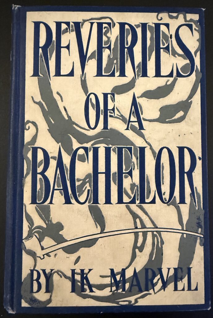
Few books in this group demonstrate the interpretive potential of a binding as clearly as the 1906 Bobbs-Merrill edition of Donald Grant Mitchell’s Reveries of a Bachelor; or, A Book of the Heart, published under Mitchell’s familiar pseudonym, Ik Marvel.
The cover feels unexpectedly bold. Enormous dark blue letters stretch vertically across a pale field, while irregular gray shapes drift behind, around, and sometimes through the typography. Near the lower portion of the design, a long curving form appears to represent a pipe, its stem extending across the cover and reinforcing the association with smoke, contemplation, and fireside reverie.
The title page credits E. M. Ashe with the book’s “Illustrations & Decorations.” A separate binding-specific attribution is harder to establish, so the cover is best understood as part of the visual program associated with Ashe rather than as a definitively documented cover design by him.
The binding becomes much more legible when considered alongside the text. Mitchell’s first reverie begins beside a wood fire and moves through sections titled “Smoke, Signifying Doubt,” “Blaze, Signifying Cheer,” and “Ashes, Signifying Desolation.” The gray forms on the binding can therefore be read as smoke, while the apparent pipe below gives that imagery a more concrete source. Together, these elements suggest not only the physical setting of the book, but also the reflective state of mind that defines it.
Mitchell’s book moves through memory, speculation, emotion, and association. Thoughts emerge, change direction, overlap, and dissolve, much as smoke curls through the air. The cover follows the same visual logic. Its monumental typography creates structure, while the drifting forms behind it seem to wander freely across the surface. The pipe anchors that movement in the familiar image of solitary reflection.
The title page continues this idea with a delicate framework that incorporates imagery suggestive of fireplace furnishings. The reader moves from the drifting, smoky exterior into the fireside setting where the reveries themselves begin. The binding does not simply decorate the book. It establishes the mental atmosphere in which the book is meant to be read.
Margaret Armstrong and the Book as a Designed Series
The final three books bring us to one of the most significant American designers of decorated publishers’ bindings, Margaret Neilson Armstrong, whose birthday falls this month. Armstrong was born on September 24, 1867, making these selections especially fitting to highlight in September.
Armstrong produced hundreds of cover designs for more than twenty publishers and became especially well known for her use of natural forms, integrated lettering, and coordinated groups of bindings. Her work demonstrates how a publisher could create a recognizable visual identity for an author while still allowing each individual title to retain its own character.
Our three Henry van Dyke books show that strategy particularly well. All are bound in dark blue cloth and decorated with gold and colored stamping. Viewed together, they clearly belong to the same family, yet each binding responds in a different way to the themes of the book it contains.
The Metropolitan Museum of Art has drawn attention to the resemblance between many of Armstrong’s designs and stained glass. The connection is especially interesting because her father, David Maitland Armstrong, and her sister, Helen Maitland Armstrong, were both accomplished stained-glass artists. In Margaret Armstrong’s bindings, individual shapes are often defined by strong outlines of gold or exposed cloth, creating areas of color that resemble pieces of glass held within lead cames. (7)
This effect is particularly apparent in her designs for Henry van Dyke.
Days Off and Other Digressions

Armstrong’s 1907 binding for Days Off and Other Digressions is almost garden-like. Tall stems rise along the sides of the cover, while pale blue, green, white, and gold forms fill the lower portion. Heavy outlines divide the colors into distinct shapes, creating the stained-glass effect associated with much of Armstrong’s work. Her small “MA” monogram appears near the bottom of the composition. (6)
Van Dyke’s essays celebrate leisure, travel, reading, outdoor experience, and the restorative value of stepping temporarily away from obligation. The Emerson verse printed on the title page speaks of time spent beside the sea, in the forest, and on the mountain. The contents continue in the same spirit, moving through vacations, childhood reading, landscapes, birds, and outdoor pursuits.
Armstrong does not attempt to depict a specific essay or scene. Instead, she turns the cover into an idealized garden in which carefully observed plants have been transformed into pattern. The design feels abundant without becoming chaotic and decorative without losing structure.
That balance makes the cover particularly appropriate for Van Dyke’s subject. Days Off is concerned with moments when ordinary routines loosen and attention can turn toward nature, memory, reading, and reflection. Armstrong’s binding captures that sense of cultivated leisure without illustrating it literally.
The Ruling Passion

Our 1912 printing of The Ruling Passion: Tales of Nature and Human Nature uses another Armstrong design, this time built around interlacing branches and cones.
The plant is not simply generic evergreen decoration. The Metropolitan Museum of Art identifies it as Eastern hemlock, Tsuga canadensis, a species associated with the northeastern forests in which many of Van Dyke’s stories are set. Armstrong’s choice of plant therefore connects the binding to the geographic and natural world of the book. (6)
This botanical specificity is one of the most compelling features of Armstrong’s work. Rather than relying on generalized floral ornament, she often observed plants carefully and translated recognizable species into highly stylized decorative systems. Her designs are neither scientific illustrations nor purely abstract patterns. They occupy a middle ground where accurate observation is transformed into ornament.
On The Ruling Passion, branches cross and recross the cover while remaining controlled around a central opening that contains the title. Nature does not sit beside the words as a separate decorative element. It surrounds, frames, and defines them.
For a collection subtitled Tales of Nature and Human Nature, that relationship feels particularly appropriate. The physical world and the human world are visually intertwined before the reader encounters the stories themselves.
The Unknown Quantity

In The Unknown Quantity: A Book of Romance and Some Half-Told Tales, published in 1912, Armstrong again uses dark blue cloth, gold outlines, and colored stamping, but the botanical vocabulary changes.
Branches grow around the title and bear pale blossoms, foliage, and rounded russet-colored fruit. The composition is lush without becoming disorderly, and gold lines hold the individual elements together in a way that again recalls stained glass. (9)
The title page provides the conceptual key with the phrase, “Let X represent the unknown quantity.”
Van Dyke’s stories are concerned with mysterious forces, relationships, and experiences that resist easy explanation. Armstrong does not attempt to illustrate those mysteries directly. Instead, her design presents growth, flowering, fruiting, branching, and connection around a central title that names something unknowable.
The result is suggestive rather than literal. The cover can be read as an image of relationships unfolding over time, of causes producing consequences, and of hidden connections becoming visible only gradually. Even the fruit seems appropriate to a book interested in outcomes that emerge from processes we do not fully understand.
Armstrong’s design therefore demonstrates an important point about visual interpretation. A cover does not need to depict a scene from the plot in order to belong deeply to the book. Sometimes it can interpret an idea instead.
Reading the Object
Placed side by side, these six volumes reveal how much information a decorated binding can carry. Bertha Stuart transforms the forget-me-not into both pattern and emotional symbol. The unidentified designer of Happiness expresses an argument about living through visual order and restraint. Reveries of a Bachelor allows smoke to become a visual analogue for memory and wandering thought. Margaret Armstrong uses flowers, fruit, and identifiable botanical species to interpret individual books while simultaneously giving Henry van Dyke’s works a recognizable visual identity.
The Armstrong volumes also remind us that these bindings were commercial objects. Their visual consistency was part of their appeal. A reader who owned one Van Dyke title might recognize another from across a bookstore or on a shelf, where the dark blue cloth, gold ornament, and botanical motifs worked together as a kind of author branding long before the modern paperback series or standardized dust jacket.
That commercial function does not diminish the artistry of the bindings. In many ways, it makes them more interesting. These were works of design created within the constraints of large-scale publishing, so they had to be visually striking, reproducible, durable, and economical enough for commercial manufacture. At their best, they also had to make sense in relation to the books they covered.
More than a century later, decorated publishers’ bindings invite us to look at books in a way that readers often overlook. A binding is not simply a protective container around a text. It is part of the history of how that text was presented, marketed, purchased, encountered, and understood.
When we preserve a decorated publisher’s binding in Special Collections, then, we are preserving much more than an attractive old book. We are preserving evidence of collaboration among authors, artists, publishers, printers, die makers, binders, and manufacturers. We are also preserving a moment when the mass-produced book could be a carefully considered work of visual design.
Most importantly, these volumes remind us that reading can begin before the first page. Sometimes the cover has already started telling the story.
Blog post by Gerald Ward – Assistant Director, Head of Archives & Special Collections
References
- American Bookbinders Museum. (n.d.). The ruling passion / Henry Van Dyke. Kathleen V. Roberts Collection of Decorated Publishers’ Bindings. https://bookbindersmuseum.org/catalog/detail/?entry_id=64185bc0-9460-11e9-9773-7962355df3bf&folder_id=3c91a280-1630-11ea-9d21-63cd57060682&page_number=1
- Boston Public Library Archives & Special Collections. (n.d.). Barbara Adams Hebard research files on Bertha Stuart book bindings. https://archives.bpl.org/repositories/2/resources/98
- Long, L. (2023, July 3). The companionable book cover designs of Margaret Armstrong. Guardians of Memory, Library of Congress. https://blogs.loc.gov/preservation/2023/07/book-designs-armstrong/
- M inside C, Version 2. (n.d.). Publishers’ Bindings, Suzy’s Collection Projects. https://digitalcellulose.com/projects/s/publishers/item/17172
- The Metropolitan Museum of Art. (2014, January 23). American bound: Watson’s rare trade bindings, part I. https://www.metmuseum.org/perspectives/american-trade-bindings
- The Metropolitan Museum of Art. (n.d.). Days off: And other digressions. The Met Collection. https://www.metmuseum.org/art/collection/search/404622
- The Metropolitan Museum of Art. (n.d.). In full bloom: Margaret Armstrong’s decorated publishers’ bindings revisited. https://www.metmuseum.org/exhibitions/in-full-bloom/visiting-guide
- The Metropolitan Museum of Art. (n.d.). The ruling passion: Tales of nature and human nature. The Met Collection. https://www.metmuseum.org/art/collection/search/888592
- The Metropolitan Museum of Art. (n.d.). The unknown quantity: A book of romance and some half-told tales. The Met Collection. https://www.metmuseum.org/art/collection/search/404151