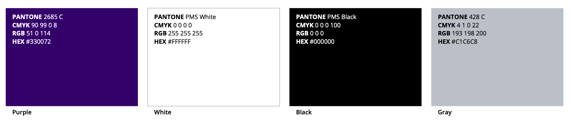
Brand Colors
Our brand colors reflect the essence of High Point University Athletics and convey a sense of pride, tradition, and innovation. Please use the following colors consistently in all branding materials:
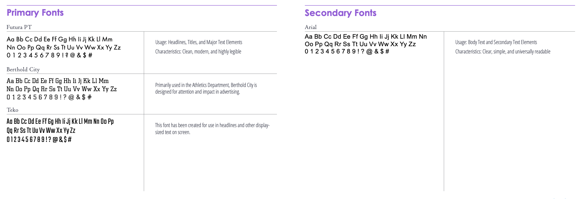
Typography
Our chosen fonts reflect a modern and professional image while maintaining readability in various applications. The primary and secondary fonts for High Point University Athletics are as follows:
Uniforms
Following brand guidelines for athletic uniforms is crucial for maintaining a consistent and professional identity for various teams representing High Point University.
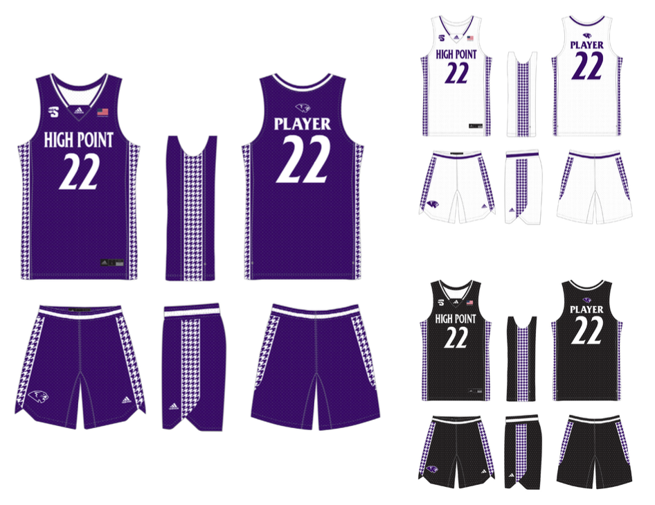
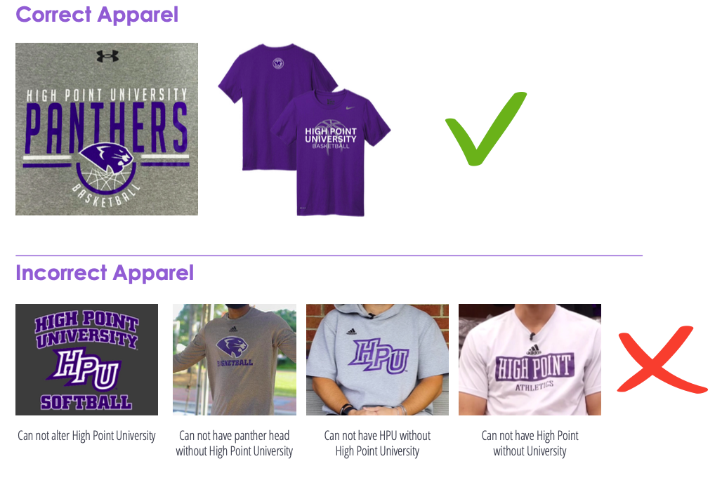
Uniforms are the only exception to not using the full High Point University name.
Uniforms may display the words “High Point” only.
TEAM RECOGNITION:
Consistent use of logos, colors, and typography ensures instant recognition of the team or organization. This recognition is vital for building a strong fan base and establishing a lasting brand presence.
UNIFIED IMAGE:
A cohesive and well-defined brand image portrays professionalism. Uniformity in design elements communicates a sense of organization and discipline, enhancing the team’s reputation and both on and off the field.
FAN LOYALTY:
Fans identify with the team’s colors, logos, and overall visual identity. By maintaining brand consistency in uniforms, teams can strengthen their connection with fans, fostering loyalty and support.
Both the men’s and women’s basketball teams at HPU are wearing new uniforms designed by award-winning designer Alexander Julian.
The “Pantherstooth” design takes the classic houndstooth pattern, and enlarge it in scale, to where it becomes a uniquely identifiable (and cool!).